Our eyes look at so many different colors throughout the day, the blue sky, the green trees, the yellow emoticons, the vibrant clothings etc. Have you ever wondered if these colors can affect you and your emotions? Amusing, right? Let’s discover more.
It’s a scientifically proven fact that each color has a different wavelength, therefore it hits and stimulates different parts of our brain. This stimulation in turn initiates different emotions and thoughts in the body. With advanced technologies it has been found that different colors influence our brain waves, hormonal activity and autonomous nervous system differently.
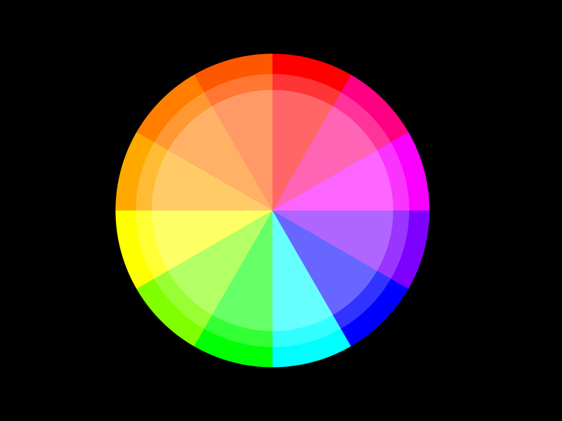
On the color wheel, red, yellow and orange hues are considered warm colors. They evoke emotions ranging from warmth and comfort to feelings of violence and hostility. On the contrary the shades of blue, green and purple are called cool colors. They are associated with calm and peace. Sometimes lower tones of these colours also evoke indifference and sadness.
The colors opposite to each other on the wheel are contrasting to each other, For eg red and green. They are used to highlight and differentiate one object from another. Such as the traffic lights use red and green to serve two different purposes. Here’s a list of how different colors can affect your brain and big brands that have used these colors in their logos for a determined motive:
Blue
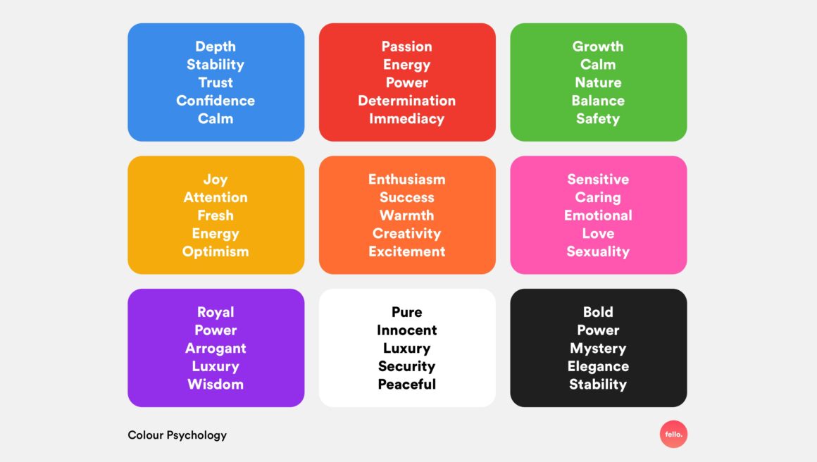
Denotes calmness, safety and stability. It was found that when blue street lights were used, road accident cases had reduced significantly.
Brands like Aquafina, Nivea, oral-B, Unilever, Twitter etc use blue color to mark purity and safety.
Red
usually denotes anger, hostility, danger, hunger or a need for attention. Traffic
lights use red color as it has the longest wavelength and can be seen from far as well. Brands like Coca-Cola, KFC, YouTube, Netflix, Band-aid etc use the color red to excite the customers and make an impulsive, bold move.
Green
it is a cool color that is often viewed as relaxing and refreshing. It sometimes
can be used to denote disgust. But more often, it is seen as a color of nature, youth and growth.
Brands like Himalaya, Starbucks, Animal Planet, Tropicana etc use green to represent nature, wealth and stability.
Yellow
It generally is a color of happiness, optimism and cheerfulness. That’s why the
smiley emotions are painted in yellow.
Brands like Snapchat, McDonald’s, IKEA, National Geographic etc use yellow color to dominate in their respective fields represent originality.
Orange
orange color is a secondary color obtained after mixing red and yellow. It is for
energy, creativity and innocence.
Brands like Fanta, Firefox, JBL etc use this color to symbolise playfulness, vitality and friendliness.
Purple
This color signifies wisdom, bravery and spirituality. It is obtained from a mixture of pink and blue. Brands like Cadbury, Yahoo, Hallmark etc use this rare color to signify their richness and leave an impact.
Black
it can depict a wide range of emotions including mystery, strength, class,
boldness, luxury etc. Often black colored clothing and vehicles are symbolic of
classiness. Brands like Apple, Sony, Adidas, Puma, Channel, Uber etc use black in their brand logos to indicate royalty and elegance.
White
If denotes serenity, peace, cleanliness and simplicity. White painted walls make
the room look more spacious. Brands like Mercedes, Wikipedia, Nestle etc use white to showcase sophistication and efficiency.
One can barely imagine a world without color, therefore its importance is utmost necessary. Knowing about colors and their effects can help you – dress yourself appropriately for different occasions, decorate your interiors well, improve your business, make designs or simply play with colors that align with your purpose.

 Add to favorites
